
Up until today, figuring out how Now I Get It! was actually being used meant opening the AWS console and running DynamoDB queries by hand. How many jobs ran this week? What's the token spend? Is anyone signing up for the waitlist? Each answer lived in a different table, and none of them had a UI.
One Lambda, Six Endpoints
The dashboard is backed by a single Lambda function that aggregates data from four DynamoDB tables -- jobs, waitlist, feedback, and copyright takedowns. It serves six admin-protected endpoints: an overview with summary counts across everything, and five time-series endpoints that accept date ranges and a group_by parameter (day, week, or month) so I can zoom in and out of trends.
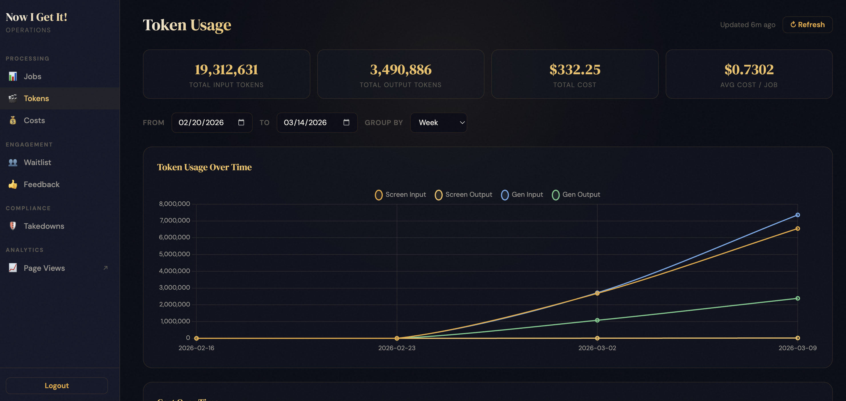
The frontend is a single HTML page with a persistent sidebar for navigating between sections: Processing (Jobs, Tokens, Costs), Engagement (Waitlist, Feedback), Compliance (Takedowns), and Analytics (which just links out to Google Analytics -- no point rebuilding what GA already does well). Each section gets summary stat cards, filter controls, and Chart.js visualizations. The whole thing matches the existing admin page's dark theme, so it feels native to the app.
The Job Mode Breakdown
One thing I really wanted was visibility into which presentation modes people prefer. Now I Get It! offers three: Native (academic style), Non-Technical (plain language), and Kid-Friendly. The dashboard now shows mode stats right on the Jobs section -- and the answer is clear: Non-Technical is the runaway favorite at 105 pages, with Native at 49 and Kid-Friendly at 11. This makes sense given the whole point of the app is making papers accessible.
Four Bugs in Four Hours
Deploying to the test environment was humbling. Four bugs, each one a different category of assumption:
The IAM surprise. The shared Lambda role didn't grant Scan on the waitlist table because the waitlist Lambda never needed it -- it only does PutItem and GetItem. But the dashboard needs to scan the whole table (it's small, no time-series index). One missing permission, one CloudFormation redeploy.
The type mismatch. Two tables store record_entry_ts as their sort key, but one uses a number type and the other uses a string. My code was passing string values to both. Worked fine for the string table, threw a ValidationException on the number table. The fix was a single int() cast, but the lesson is that DynamoDB schema types can vary across tables in ways that aren't obvious until you query them.
The $NaN card. The API returns cost values as strings (like "212.86"), but the JavaScript was summing them with += instead of parseFloat(). JavaScript happily concatenated the strings instead of adding them, and when the result hit a currency formatter, it became $NaN. Classic JS gotcha.
The disappearing filter. The Group By dropdown -- Day, Week, Month -- appeared to do nothing. The section reload replaced the entire DOM (including the filter bar) with a loading spinner before reading the current filter values. By the time the new content loaded, the filter was gone and the code fell back to defaults. Fixed by persisting filter state in a JavaScript object that survives the DOM teardown.
Deploy Subcommand
Iterating on the dashboard during testing meant running two deploy commands every cycle -- backend to update the Lambda, then frontend to push the HTML. I added a dashboard subcommand that does both in one shot with a targeted CloudFront invalidation, so future dashboard work is a single command: ./deploy-prod.sh dashboard.
What the Numbers Say
With the dashboard live on prod, I can finally see the big picture at a glance: 490 total jobs processed (97.8% success rate), $332 in total API costs, 231 waitlist signups with a 60% confirmation rate, 87% positive feedback, and 6 copyright takedown requests. Not bad for a side project.